Books were launched.
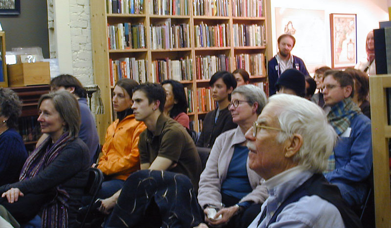
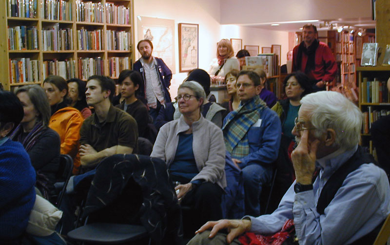
On a cool, rainy evening in Seattle, several dozen people came together at Wessel & Lieberman Booksellers, in Pioneer Square, for the dual purpose of viewing an exhibit of my book designs and launching my two new books, the first two in the “dot-font” series from Mark Batty Publisher. Books were looked at, books were sold, books were signed. Although it was one of those Thursday evenings where everyone in town seemed to have multiple commitments, we got a pretty good crowd, and most of them stuck around for the reading.
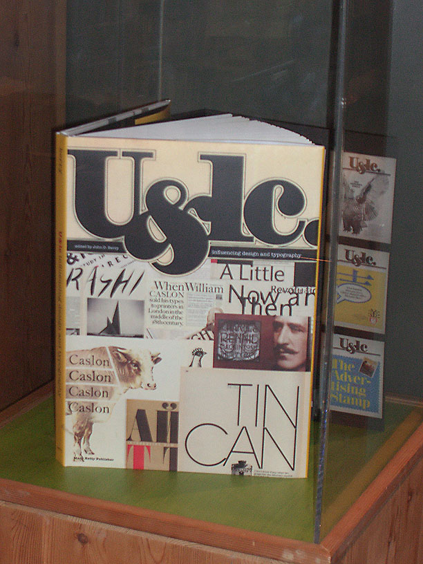
To keep it brief yet give people an idea of what’s in the books, I read excerpts from three essays that seemed not to rely too heavily on the accompanying illustrations. (Curious? They were on the effect of bad typography on real-life things like voting and getting out of a burning building [“Electoral typography”], the inadequacy of wall text in art museums [“Room with a view”], and how Sumner Stone saved digital typography [“Type traditions in a digital age”].)
My main point was that since we do live in a designed world, we might as well pay attention to it and do it right.
Microsoft Typography’s Simon Daniels (standing, leaning against a bookshelf, in two audience photos) snapped some shots with his mobile phone, and posted them on the Microsoft Typography website. Later, type enthusiast Karla Starr wrote an account of the event in the April 4 issue of Seattle Weekly.
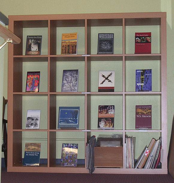
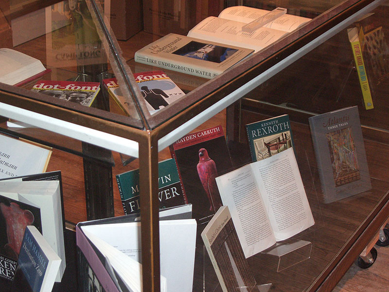
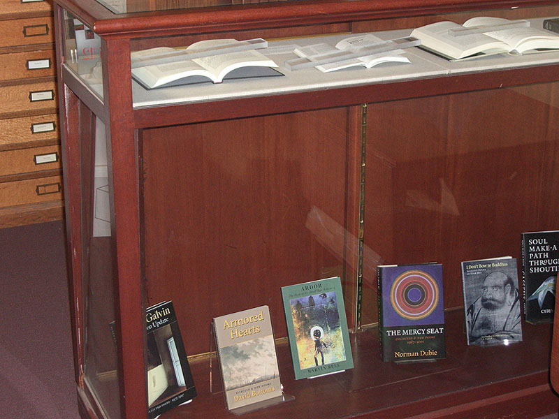
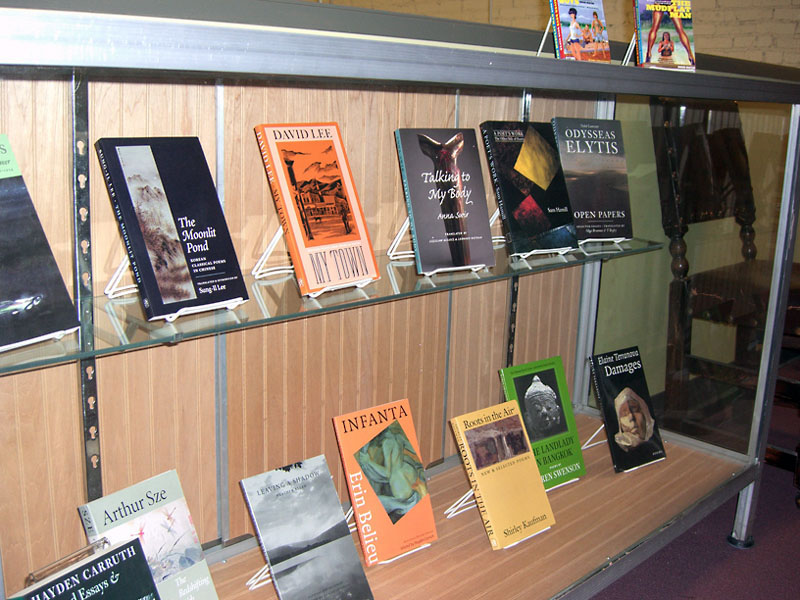
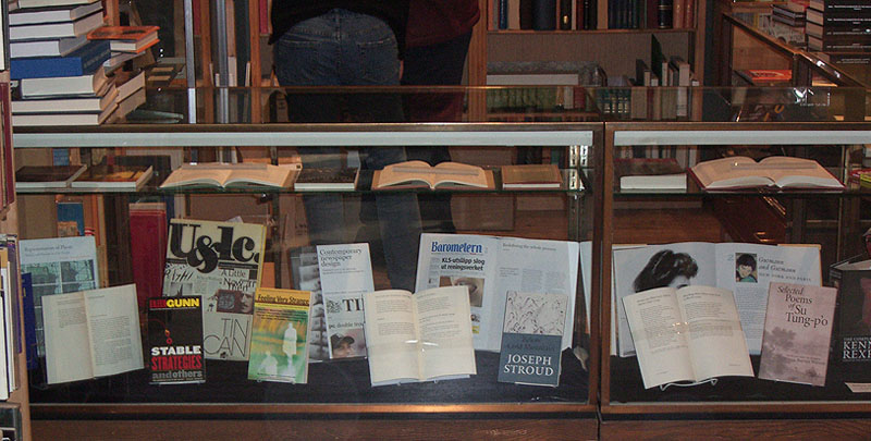
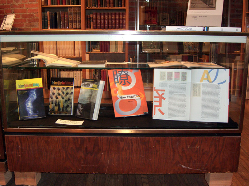
The exhibit shows books that I’ve designed over the past couple of decades, in a variety of styles and for a variety of publishers. Some just show covers; others show the interiors, which to me are the heart of a book. Although a book cover ought to grow out of the interior, the realities of book publishing are that covers get designed long before the meat of the book is even finalized; it’s amazing when covers and interior pages in most books bear any resemblance whatsoever. I’ve designed everything from intensively textual books like novels or books of essays to highly visual art books and books about graphic design. From the beginning of my career I’ve used digital technology; I like to think that this exhibit shows that you can achieve traditional book design quality — in any tradition, from Renaissance typography to the most severe Modernist tradition — using the tools available to any typographer today. You can achieve any effect; but first you have to understand what it is you’re trying to achieve.
– John D. Berry | Apr 4 2007